
Results Tab
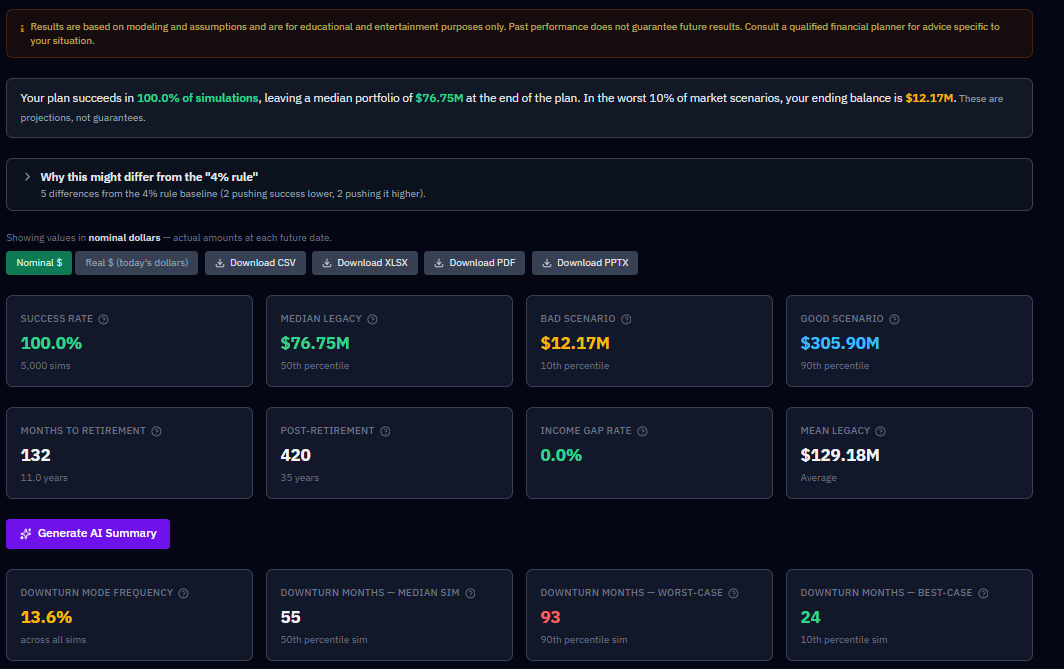
The Results tab is where you see the outcome of your simulation. The Run Simulation button is available from just about anywhere in the app — once your household, accounts, and strategy are set, click it and RetireRange runs thousands of randomized futures (5,000 by default), then shows you the results here.
What’s on the tab
The tab is organized around six questions. A bar pinned to the top of the tab while you scroll jumps to each one, and each question’s heading carries a one-line headline answer on the right, so you can read the tab top to bottom or go straight to the question you came with.
Above the first question sit the controls that affect every section: the Nominal / Real dollars toggle and the CSV, XLSX, PDF and PPTX export buttons.
Will my money last?
Headline answer: your Success Rate.
- Plain-language summary and the "4% rule" comparison.
- Headline metrics — Success Rate, Median Legacy, Bad Scenario (P10) and Good Scenario (P90), Mean Legacy, and Income Gap Rate (the shortfall measure), plus countdown stats (months to retirement and post-retirement length). (After-tax legacy and lifetime Social Security appear on the Compare tab and in the What-If calculator.)
- AI summary — the plain-language write-up of your run. It is given your exact withdrawal target (for example "$4,500/month (gross withdrawal)" or "4% of portfolio plus $500/month"), and every summary ends with a note that it was produced by AI, is not financial advice, and should be reviewed with a qualified advisor. On a Guardrails plan, it’s also given whether your upper and lower guardrail bands actually bound — and how much they cut or added — so it can discuss what guardrails actually did for your plan, not just the percentages you configured; it’s instructed to present a cut and a bonus together rather than describe guardrails as pure loss.
- Portfolio Trajectory — your range of outcomes over time (P10–P90 bands with the median line), with the bad-sequence overlay. A red dashed line marks Retirement, and a purple dashed line marks each person’s RMD onset — one per household member who owns Traditional balances and reaches the onset age within your plan (labeled with their name and age). The RMD line marks who starts RMDs at that point, not whose balance is largest; no RMD line for a person means they own no Traditional 401(k)/IRA, or their onset falls outside the plan horizon. Neither marker is drawn if the event falls at or before your plan’s start — an already-retired household, or an owner already past RMD onset age at plan start, has no line to draw, since the event isn’t ahead of you on the chart. Same behavior on the Account Balances Over Time and Ruin Probability charts, and on the Historical Backtest chart.
- Probability of Ruin by Year.
Where does my income come from?
Headline answer: the share of your retirement income that comes from somewhere other than the portfolio — Social Security, pensions, annuities, rental and other income, policy loans. It’s left off when there’s nothing to report.
- Monthly Retirement Income — a stacked bar per year, shown as a calendar-year monthly average per source, not a single sampled month. Fixed income sits at the base; Portfolio Draw (green) fills the gap above it. Any one-time withdrawal you scheduled gets its own Lump Sum band (lime), directly above Portfolio Draw — so a big year reads as the event you entered, not as a mysteriously doubled draw. A Lump Sum band in one year is your plan, not a model artifact. The chart’s data table, and its CSV/PDF/slide exports, carry a matching Lump Sum column.
- Account Balances Over Time and Ending Balance by Account (Median).
What will I pay in tax?
Headline answer: lifetime taxes paid (median) — shown with the reminder to read tax alongside Success Rate, because a plan that pays less tax can still be the weaker plan.
- Annual Tax Estimate — federal and state tax by year. The state figure is the state tax your plan actually paid each year (the median across simulations, with P10 and P90), so it includes your state’s retirement, military and Social Security exemptions. The federal figure is estimated from median taxable income. Earlier versions recalculated state tax here without those exemptions, which overstated it in states that exempt retirement income, sometimes by tens of thousands of dollars over a plan. The Year-by-Year state tax column, the What-If panel’s lifetime state tax and the AI summary all use the same figure.
- Projected Annual RMDs — calendar-year aligned.
How bad can it get?
Headline answer: your Bad Scenario (P10).
- "If the first five years go badly" — four stats (Survived a Bad Start / Survived Otherwise / Median Legacy — Bad Start / Median Legacy — Otherwise) isolating sequence-of-returns risk on every run with any retirement in it. See Understanding your results.
- Deepest Market Drop & Lowest Balance — four stats on every run: the worst peak-to-trough investment-return drawdown (typical and worst-case) and the smallest the spendable accounts ever get (typical and worst-case). See Understanding your results for how the two differ.
- Ending Balance Distribution.
- Downside Protection: what it buys, what it costs — appears when your strategy carries a sequence-of-returns defense (downturn-aware withdrawals, a cash reserve, or both), and prices what that defense buys against what it costs. See below.
- Guardrails outcome stats — for plans on the Guardrails withdrawal method only: Spending Given Up to Guardrails, Spending Given Up — Worst-Case, Extra Spending From Guardrails, and Months a Cut Applied. See Understanding your results.
What would change the outcome?
Headline answer: the assumption that matters most — once you’ve run the sensitivity sweep; until then it prompts you to run it.
- Sensitivity Analysis — a nine-pass tornado sweep; see Sensitivity Analysis, including how to cancel a run in progress.
- What-If Quick Calculator — an instant, deterministic baseline-versus-one-change table (see What-If Quick Calculator). It includes Lifetime Taxes Paid, which is the federal plus state income tax actually assessed over the plan, including the 10% early-distribution penalty, so it is comparable to a real tax bill. Earlier versions summed taxable income under this label, which overstated it several-fold, so figures from older screenshots or exports will look much larger. Read it alongside Success Rate, never on its own.
The details
Headline answer: how many years your plan covers.
- Year-by-Year Breakdown — a table with one row per plan year. Each row is labelled with the calendar year it covers, and every column describes that same year: income, federal and state tax, and RMDs are that year’s flows, while the portfolio columns (P10, P50, P90) are year-end balances. The same table is in the CSV, XLSX, and PDF exports.
- Scenario Comparison — how this run compares with your saved scenarios.
A dash means "not available," not zero
Where a figure could not be computed for a run, the Results tab, the What-If card, and the exports show an em dash (—) instead of $0. A genuine zero still shows as $0.
Downside Protection: what it buys, what it costs
Downturn-aware withdrawals and a cash reserve both exist to defend against one specific risk: sequence-of-returns risk — the danger that a crash lands in your first few retirement years, while you’re selling to fund spending. Two retirements with the same average return can end very differently depending on when the bad years arrive, because shares sold into an early slump are gone before the recovery. That’s the risk this machinery is built to blunt, and it’s the lens to read the whole card through.
If you’ve turned on either lever, RetireRange runs your plan twice — once as configured, once with that defense stripped out — against the same random market sequences, and reports the difference. The card exists to answer one question: is my sequence-risk defense earning its keep?
Every number on this card is a difference, not a level. This is the most common misreading, and it makes the whole card confusing until it clicks. "Worst-case floor lift" is not your P10 legacy — it is how many dollars the defense added to it. Your actual P10 is the amber Bad Scenario tile at the top of the page. A success-rate line reading −0.8% does not mean 0.8% of plans succeeded; it means your success rate is 0.8 percentage points lower with the defense on than off. Read every tile as "with the defense, minus without it."
It opens with the doctrine it’s built on: in calm markets this costs a little; in bad markets it protects you — that trade is the point. The five numbers are then split into two panels so the trade is legible rather than buried.
Protection — what it buys you (three tiles, leading the card):
- Worst-case floor lift — how much the defense raises your 10th-percentile legacy. This is the tail it exists for.
- Success rate — more plans finishing above zero.
- Income-gap rate — the change in your income-gap rate with the defense on, where lower is better. A negative number is good news: fewer futures in which you’d have had to cut back.
Premium — what it costs you (two tiles, secondary):
- Median legacy — the central-case cost of the insurance.
- After-tax legacy (P50) — the same cost after heir tax.
A small negative in the Premium panel is expected, not a loss — the card says so. It’s the price of the protection above it.
Same name, two different things. The Protection tile and the headline stat at the top of this tab are both called Income-gap rate (the Scenario Comparison card shortens it to Income Gap), and they are the same underlying measure — but the headline is a raw rate for one strategy, while the tile is a difference: your income-gap rate with the defense on, minus the same rate with it off. The tile’s subtitle says so, and it says which way to read the sign: lower is better, so a red +0.8% means the income-gap rate is 0.8 percentage points worse with the defense on.
When a protection number goes negative
Nothing guarantees the Protection tiles come out positive. A defense can genuinely lower your success rate, and the card will show it in red. Before you act on that, check two things.
Is it inside the noise? Success rate and P10 are tail statistics, estimated from a thinner slice of the sorted outcomes than the median, so they carry more Monte Carlo noise. At the default 5,000 simulations, treat a delta under roughly a percentage point as unconfirmed until a second run agrees with it. Raising the simulation count on the Household tab tightens the estimate.
Is your mortality setting stochastic? This one matters more than it sounds. The two runs share market seeds — same markets, only the strategy differs — and that pairing is what makes the comparison trustworthy. But under stochastic mortality, death months are drawn separately from market returns, so the defended and undefended runs can hand the same simulation different lifespans. That breaks the pairing the card depends on, and it can manufacture a delta of about a point out of nothing. Switch mortality to deterministic and re-run before drawing any conclusion from a small number. It is the cleanest measurement this card can give you.
If a negative survives both checks, it is telling you something real: cash is a permanently underperforming slice of the portfolio, and for plans that were already marginal, the growth given up can outweigh the crash protection bought. An oversized reserve is the usual culprit — try a smaller one paired with guardrails, which cost no median growth in calm markets.
A lower success rate alongside a higher floor is not a contradiction. Success rate counts how many plans hit zero; the floor measures how bad the bad ones got. A reserve can make survivable-but-ugly futures less ugly while tipping a few already-marginal ones over the edge. That is a coherent result — it just is not the trade most people assume they are buying.
Worst historical starts
Below the panels, a summary drops your plan onto the five worst starts on record — 1929, 1966, 1973, 2000, 2008 — twice each, defense on and defense stripped, and reports "your plan would have survived X of 5 with defense on vs. Y of 5 with defense stripped." A per-sequence ✓/✗ grid shows exactly which starts flipped.
Note the word starts. These aren’t simply the worst markets in history; they’re the worst years to have begun a retirement, which is precisely what sequence risk means. This is the most concrete sequence-risk test on the tab: percentages are abstract, but "1966 fails without the reserve and survives with it" is not.
Advantage by market percentile
The card’s flagship chart plots one point per simulation. Each sim is ranked left-to-right by how good its market turned out to be — measured on the counterfactual ending balance, what that sim would have finished with if the defense had been stripped out. The y-value is what the defense did to that same sim: dollars gained or lost. An amber dashed zero line splits it in two.
Ranking on the counterfactual matters, because it is independent of what the defense did. The chart can’t flatter itself.
The shape is the shape of an insurance policy, read right to left:
- Left side — the payout. Sims whose markets were poor, which would have ended poor without the defense. Points above the zero line here are money the defense bought you. This is the region it exists for.
- Right side — the premium. Sims whose markets were good, which would have ended rich anyway. Points below the zero line here are the growth you gave up holding cash and skipping equity sales you turned out not to need.
- Where the line crosses zero tells you the split: how many of your simulated futures collected on the policy versus paid for it.
A well-designed defense gives up a little on the right to gain a lot on the left. A flat line near zero means the defense never engaged. A curve that’s negative nearly everywhere means you’re over-insured. Read the dollar scale on the y-axis alongside the shape — a beautifully asymmetric curve worth $4,000 either way isn’t telling you much.
What the ranking is and isn’t. "Market percentile" is each sim’s rank in the defense-off ending-balance distribution — a proxy for how favorable that sim’s market was, not a direct measure of it. Ending poor usually means bad markets, but a plan can also end poor from a bad sequence with fine average returns. For a direct measure — sims ranked and grouped by their actual first-five-year investment returns, not a counterfactual proxy — see "If the first five years go badly", and the Worst historical starts box above remains the sharper instrument for the specific question of whether the defense earns its keep against a named bad start.
For how to act on all this, see Protect against sequence-of-returns risk, and the Downturn Defense optimizer for sizing the levers.
This page is about producing the result. For how to read and act on all of it — what the numbers mean, what to watch, and what to do next — see Understanding your results, the companion guide.
After a run
The natural next moves:
- Save it as a scenario so you can come back to it.
- Change one thing and run again.
- Compare versions head-to-head.
You can also raise the simulation count (on the Household tab) to 10,000 for extra precision on a close decision.