
Understanding Your Results
RetireRange doesn’t give you one number — it gives you a distribution of outcomes across thousands of simulated futures. That’s the point: your real future is unknowable, so the honest answer is a range and a probability, not a single prediction. This page explains how to read what you see and, more importantly, how to act on it.
The Results tab is organized around the questions this page answers, each with a headline answer beside its heading and a bar at the top of the tab to jump between them:
| On the Results tab | Read about it here |
|---|---|
| Will my money last? | Start with three numbers, and the ruin-probability chart under The deeper charts |
| Where does my income come from? | Monthly income and the account stack under The deeper charts |
| What will I pay in tax? | Tax and RMDs under The deeper charts, and the caution on Lifetime Taxes Paid |
| How bad can it get? | Downside protection, the first five years, deepest drop and lowest balance, guardrails, and stress-testing |
| What would change the outcome? | Sensitivity Analysis and the What-If Quick Calculator |
| The details | The Year-by-Year Breakdown and Scenario Comparison — see Results tab |
Start with three numbers
After a run, look at these first.
Success Rate
The share of simulated futures in which your money lasted to the end of your plan. 90% means your plan survived in 9 of 10 simulated futures.
The catch most people miss: higher isn’t automatically better. A 99% success rate can mean you’re being so cautious that you’ll leave a large unspent balance and live smaller than you needed to. Think of success rate as resilience — aim for a level you’re comfortable with (many people target 85–95%), not the maximum. If yours is very high, ask the opposite question: could I spend more?

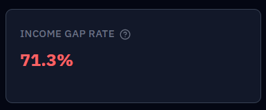
Income Gap Rate (shortfall)
Shown as "Income Gap Rate" on the Results tab.
The share of futures where, at some point, you couldn’t fully fund your spending target even after drawing from every account. For many retirees this matters as much as the success rate — it measures how often you’d have had to cut back, even briefly. A year-end tax bill that can’t be fully paid from the portfolio also counts as a shortfall for that month, so it lowers Success Rate and raises this rate.
(On the Downside Protection card the same measure appears as a delta — your income-gap rate with the defense on minus the rate with it off, where lower is better. Same metric, framed against a counterfactual.)
The range itself (the trajectory chart)
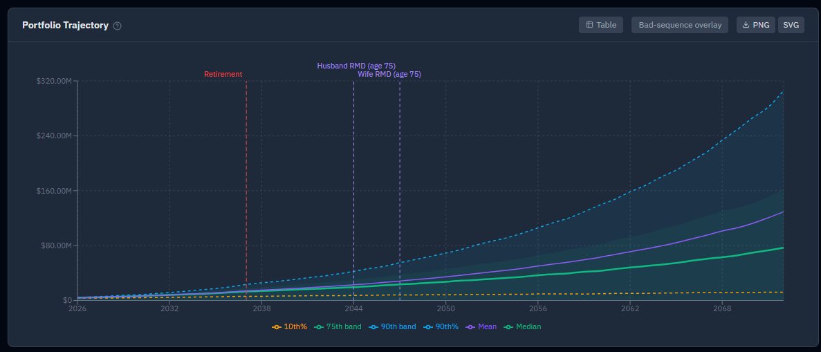
The shaded bands show how your portfolio could evolve over time:
- Center line — the median (typical) outcome.
- Inner band — the middle half of outcomes (25th–75th percentile).
- Outer band — the broader range (10th–90th), i.e. unlucky to lucky.
A wide band means more uncertainty (often a stock-heavy plan). A band that trends toward zero in its lower edge is a warning. Toggle nominal vs. real dollars to see whether your income holds its purchasing power over time — real dollars are usually the more realistic view.
Watch the bottom of the range, not just the middle. The median assumes average luck. Your plan’s safety lives in the P10 (worst-luck) line — if that holds up, you’re robust; if it collapses, you’re exposed even if the median looks fine.
What your plan leaves behind
- Median ending balance — the typical amount left at your plan’s end; a proxy for your legacy.
- After-tax legacy — what your heirs would actually keep after the tax on what they inherit, applied per account type: inherited Traditional and HSA balances are taxed at your heirs’ ordinary income rate (plus any state rate), while Roth, Taxable, and VEBA pass at full value (Taxable via a step-up in basis). This is the more realistic legacy number — and the one to use when comparing a Roth-heavy plan against a Traditional-heavy one. Set the rates on the Assumptions tab; see Taxes.
The deeper charts
When you want detail beyond the headlines:
- Ruin-probability chart — the cumulative share of futures that have run out of money by each point in time. This is where you learn when failures happen — something Success Rate alone can’t tell you. Success Rate answers "did the plan ever fail?"; it can’t distinguish a plan whose failures cluster at year 35 (you outlived a long, mostly-funded retirement by a few years) from one whose failures hit at year 12 (an early sequence-of-returns disaster). Both can read "90%," but they’re completely different risks. So read the shape: a curve that stays flat and near zero until very late is reassuring, while one that ramps up steeply in the first several years is a sequence-of-returns warning — failures are early and catastrophic. Flat-and-late beats steep-and-early, even at the same success rate.
- Monthly income — your income over time, split by source (Social Security, Pension, Annuity, Rental, Other Income, Policy Loan, Portfolio Draw, Lump Sum, Medical, Shortfall). Lump Sum is any one-time withdrawal you scheduled, broken out of Portfolio Draw so it’s named: a tall lime band in one year is a purchase or gift you entered, not a model glitch. Because each bar is a yearly average, a $300,000 event lifts every month of its year by $25,000 rather than spiking one month — the band is how you tell that apart from ordinary spending. Each bar is now a calendar-year monthly average — that source’s total for the year divided by the in-plan, post-retirement months in it — not a single sampled month, which used to let bookkeeping timing (the December tax draw, RMD smoothing) masquerade as a real income spike. A year with a mid-year event, like a June retirement or a June Social Security claim, reads as a blend — roughly seven-twelfths of a full month’s benefit on the year you claimed mid-year, for example — because that’s genuinely what that calendar year paid; it isn’t a cut. The table’s last column, Annual total (calendar year), is the one to read for full-year totals, and it’s unchanged in meaning.
- Annual Tax Estimate — estimated yearly federal and state tax; useful for spotting spikes from large RMDs or conversions.
- RMD projection — when and how much you’ll be forced to withdraw from Traditional accounts. For any plan that doesn’t start in January, RMD, tax, and Social Security rows are now aligned to the calendar year the money actually moved in (they previously summed a window anchored to the plan-start anniversary, which could book a December RMD against the following year). The first RMD year also no longer shows an artificial one-month spike in Portfolio Draw — the required amount now spreads evenly from the birthday month through December, the same smoothing every later year already used. Annual totals aren’t changed by either fix, only which month/year label the dollars land under.
- Ending-balance distribution — the spread of final outcomes; a long right tail means big-legacy futures, a pile-up near zero means many near-depletions.
- Account stack — how each account draws down over time and which type carries you at each stage.
Downside protection is insurance — read it that way
The steep-and-early ruin curve above has a name: sequence-of-returns risk. It’s the danger that a bad market lands in your first few retirement years, while you’re selling to fund spending — shares sold into an early slump are gone before the recovery arrives, so two retirements with the same average return can end very differently depending purely on when the bad years fall. It’s the risk that makes early failures so much worse than late ones.
Downturn-aware withdrawals and a cash reserve are the levers that defend against it, and if your strategy carries either, the Results tab shows a Downside Protection: what it buys, what it costs card comparing your plan against itself with that defense stripped out, on identical market sequences. The single most common way to misread it is to look at the median.
Protection behaves like any insurance policy: it costs you a little in an average market and pays you back in a bad one. So the honest scorecard has two halves, and the card labels them — Protection (worst-case floor lift, success rate, failure paths avoided) and Premium (median legacy, after-tax legacy). A small negative in the Premium panel isn’t a leak in your plan; it’s the price of the floor above it. A defense that costs nothing in the median almost certainly isn’t doing anything in the tail either.
The card’s Advantage by market percentile chart makes this literal. Every simulation is plotted as one point, ranked left-to-right by how good that sim’s market turned out to be — measured on what it would have finished with had the defense been stripped out, so the ranking is independent of anything the defense did. The y-value is what the defense did to that same sim. The left side is where the payout lives: poor markets, where the protection bought you money. The right side is where you paid for it: good markets, where holding cash cost you growth you turned out not to need. That’s the whole trade in one picture — give up a little on the right, gain a lot on the left. (The ranking uses the counterfactual ending balance as a stand-in for market quality. It’s a fair approximation, not a direct measure — it can’t separate an early crash from a late one the plan never recovered from.)
So when you evaluate a defensive lever, judge it on P10 legacy, success rate, and income-gap rate, and treat the median dip as the invoice. Watch the ruin-probability curve too — a defense that’s working flattens the steep early ramp, which is the sequence risk itself receding. If none of those move, you’re paying for nothing — turn it off or size it differently. Sizing is what the Downturn Defense optimizer is for; Protect against sequence-of-returns risk walks the whole exercise.
"If the first five years go badly"
Sequence-of-returns risk isn’t about your average return — it’s about the order those returns arrive in. A bad market in your first few retirement years does far more damage than the identical bad market twenty years in, because your portfolio is at its largest and every withdrawal sells more shares than it would later. Two retirements with identical average returns can end very differently depending purely on which years were the bad ones.
This card measures exactly that, directly, rather than leaving you to infer it from the ruin-probability curve’s shape. It sorts every simulation by how its first five retirement years actually performed in the market, takes the worst fifth of those, and reports four figures: Survived a Bad Start and Survived Otherwise (success rate for the worst-start group vs. everyone else), and Median Legacy — Bad Start / Median Legacy — Otherwise. The split is made on the market alone, not on how the simulation ended — ranking runs by their outcome and then reporting that bad-start runs did worse would be circular — and it uses investment returns only, so your own spending doesn’t color which runs land in the "bad start" group.
How to read it: the gap between the two success-rate figures is what a bad start costs this plan. A large gap means sequence risk is the binding constraint on your success rate, and it’s worth testing downturn-aware withdrawals and a cash reserve — re-run with them on and watch the gap narrow. A near-zero gap is genuinely good news: your spending is comfortably covered regardless of when the bad years land, and sequence risk isn’t this plan’s problem — don’t read a near-zero gap as a broken card. One caveat: the five-year window is fixed and isn’t adjustable.
Deepest market drop & lowest balance
Two more figures worth knowing apart, because they answer different questions and are easy to conflate: Deepest Market Drop (Typical and Worst-Case) and Lowest Balance (Typical and Worst-Case).
Deepest Market Drop is the worst peak-to-trough fall in investment returns along a path — the market crash you actually lived through. It’s built from investment gain only, so money you contribute or withdraw never counts as a gain or a loss. Lowest Balance is the opposite on purpose: the smallest your spendable accounts ever get, in dollars, and spending does move it — it answers "how close to the bone does this plan run."
The distinction matters more than it looks: if a drawdown just meant "how far my balance fell," every plan that spends itself down in retirement would show a ~100% drawdown and the figure would be useless. Two caveats worth keeping in mind: (1) both drawdown figures exclude property, life-insurance cash value, and medical accounts, so they can read differently from the Portfolio Trajectory chart, which plots total wealth — an appreciating rental doesn’t soften your market drop here; (2) a plan that runs out of money stops being exposed to the market, so a failing plan can show a shallower drawdown than one that survived the same market. Don’t read a small drawdown on a failing plan as good news — read it alongside the success rate.
The clearest single use of these figures: run your plan once with downturn-aware withdrawals and the cash reserve off, once with them on, and compare Deepest Market Drop — Worst-Case on the Compare tab. It’s the sharpest available answer to "what does this protection actually buy me."
What guardrails actually did
If your plan uses the Guardrails withdrawal method, a row of stats shows what the guardrails did to your spending, not just what percentages you configured: Spending Given Up to Guardrails, Spending Given Up — Worst-Case, Extra Spending From Guardrails, and Months a Cut Applied. Plans on Classic or Dynamic don’t see this row at all — that’s expected, not a missing card.
Guardrails silently rewrite your monthly spending target — down when your withdrawal rate runs hot against the upper rail, up when the portfolio does well against the lower rail — and these figures put dollars on both directions for the first time. The first two total what the upper rail trimmed across the whole plan (median, and the worst 10% of simulations); the third totals what the lower rail added; the fourth counts how many months a cut was in force.
Read the cut and the bonus together, always. Seeing only "you gave up $180,000" reads as guardrails being expensive — but guardrails cut and raise by the same rule, so the cut figure only means something next to the bonus. The net lifestyle effect is the bonus minus the cuts, and the trade a guardrails plan makes is some spending certainty for a higher chance the money lasts, not a one-way loss. A useful tell: a high month-count with a small dollar total means many gentle trims, while a low count with a large total means a few severe ones — very different retirements that only these two figures together distinguish. One caveat: these are cumulative totals over the whole plan in nominal dollars, so they look large by design; in the inflation-adjusted (real) view they deflate like any other dollar total. See Strategy tab for what the Upper and Lower guardrail percentages themselves control.
Stress-testing the result
The percentile bands capture general bad luck. To pressure-test against specific bad histories:
- Bad-sequence overlay (a button on the Results tab) drops your plan onto the worst real starting points on record (1929, 1966, 1973, 2000, 2008) — five deterministic lines over the percentile bands. This is sequence risk made concrete: same plan, same assumptions, different decade to have begun in.
- The Historical backtest replays your plan across every start year since 1928.
See what if returns disappoint? for how to use these together.
Turning results into decisions
A single run is a starting point, not a verdict. The real workflow:
- Save it as a scenario.
- Change one thing and run again.
- Compare them on the same market sequences.
If your success rate is lower than you’d like: delay retirement, trim or phase spending, delay Social Security, switch to Guardrails, or hold a larger cash reserve (optionally with recovery refill, so it restocks in good years). If it’s very high: consider spending more, retiring earlier, or gifting — you may have more room than fear suggests.
One caution on the "Lifetime Taxes Paid" figure (the headline answer to What will I pay in tax? on the Results tab, and shown in the Compare tab and Optimizer): never minimize it on its own. At high withdrawal rates taxes can drop simply because the portfolio depletes faster — fewer dollars left to tax. Always find the high-success-rate plans first, then compare taxes within that group.
Unfamiliar with a term? See the Glossary.