
Sensitivity Analysis (Tornado Chart)
Of all the assumptions in your plan, which ones actually move the outcome? Sensitivity Analysis answers exactly that. It nudges your key inputs up and down, re-runs, and shows you — as a tornado chart — which ones your plan is most sensitive to.
How it works
Sensitivity analysis starts from your own plan — the same assumptions you’ve entered. It takes your current scenario as the baseline, then changes one assumption at a time by a set amount, leaving your other assumptions untouched. Nothing is swapped for generic or default numbers; every variation is your plan with a single nudge.
Worth knowing: the whole sweep shares one underlying set of random market futures — the baseline and all eight variations replay the same draws (a technique called common random numbers). That’s what makes each bar a clean, apples-to-apples measure of the single change you made, rather than mixing in the luck of a fresh random roll. Two things follow from it: a variable’s favorable and unfavorable bars always point in opposite directions (so a small real effect isn’t swamped by noise), and the sweep’s baseline reproduces your Results tab run exactly — the tornado can’t contradict your headline numbers, because it’s replaying the very same futures that produced them.
When you run it, RetireRange performs nine simulations: your baseline, plus eight variations that each change one assumption:
- Stock returns +1 and −1 percentage point
- Bond returns +1 and −1 percentage point
- Inflation +1 and −1 percentage point
- Withdrawal target +10% and −10%
Each variation is scored on your result metrics (success rate, legacy, and so on), and the chart shows how far each one moves the needle.
This is a fixed set of four inputs. Sensitivity analysis tests only these market-and-spending assumptions — it does not sweep the bigger decisions in your plan, such as when to claim Social Security, your account allocation, Roth conversions, healthcare costs, or your retirement date. If one of those isn’t on the chart, that doesn’t mean your plan is insensitive to it — it just isn’t part of this test. To weigh those, hand the decision to the Optimizer (which searches it for the best value), or save variants and put them head-to-head on the Compare tab.
Running those nine simulations takes a little longer than a single run — usually about ten to fifteen seconds, and up to a minute or so at high simulation counts or on an older device. That’s why it’s an explicit, opt-in click, not something that fires on every change.
Spotted a mistake mid-run? Stop it. While a sweep is running, the button turns into a red Cancel. Before you’ve run one, that’s the full-size Run Sensitivity Analysis button; once a chart already exists, it’s the compact Re-run button, which becomes Cancel (3/9) — the same pass counter that used to read "Pass 3/9…" now rides along in the button label and its hover tooltip. One click stops the sweep immediately and discards it — no partial chart, no error, because cancelling isn’t a failure. Any chart already on screen from a previous run stays put; re-running starts the nine passes over from the beginning. (The brief "Loading strategies…" phase at the very start isn’t cancellable — the button is simply disabled until the sweep itself begins.)
How to read the tornado chart
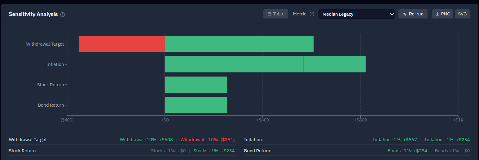
The bars are sorted longest-to-shortest, forming a "tornado" shape:
- A long bar = your plan is highly sensitive to that assumption. (A long "Stock returns ±1%" bar means your outcome rides heavily on the market.)
- A short bar = that assumption barely matters for your plan.
- Each bar extends both ways from the baseline — the favorable change on one side, the unfavorable on the other.
What to do with it
- Focus your attention. Spend your energy pinning down the assumptions with the longest bars; don’t agonize over ones that barely move the result.
- Decide what to stress-test next. If stock returns dominate, that’s your cue to run a pessimistic-returns scenario — see what if returns disappoint?
- Understand your plan’s character. Is your success driven mostly by markets, by inflation, or by spending control? The tornado tells you.
Reading small bars. Because the whole sweep shares one set of random futures (see common random numbers, above), each bar is a true marginal effect: a variable’s favorable and unfavorable changes point in opposite directions, and a short bar simply means your plan isn’t very sensitive to that assumption. Read the shape — the clearly long bars are where your attention belongs.
For the metrics themselves, see Understanding your results; for the assumptions being perturbed, see the Assumptions tab.