
Compare Tab
The Compare tab answers the question "which of these strategies is actually better?" It runs up to five side by side against the same random market sequences, so any difference in outcome reflects the strategy, not luck.
Why it’s different from running simulations separately
If you run two plans separately, each gets its own random draws — so when results differ, you can’t tell whether the strategy was better or the dice were kinder. The Compare tab removes that doubt by running every selected strategy against the same set of market sequences (shared seeds). Each strategy faces identical markets, so the differences are causal, not chance. (The proof: compare a strategy against an identical copy of itself and every number matches exactly.)
Before you start
Two prerequisites:
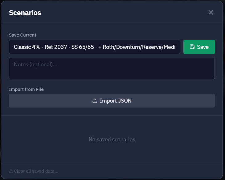
- Save a baseline. Comparison needs a saved baseline so every strategy shares identical starting balances — the tab is disabled until you’ve saved one (you’ll see a "Save a baseline first" message).
- Save the plans you want to compare as named strategies — from the Strategy tab (the Strategies button) or out of the Optimizer. Your baseline plan doesn’t need saving as a strategy — the Compare against baseline toggle (on by default) draws it automatically — so often you only need to save the one variation you want to test against it.
How to use it
- Open the Compare tab (in the header, between Results and Strategy).
- Keep "Compare against baseline" on. This toggle — at the top of the Select Strategies to Compare card, on by default — draws your saved baseline plan as an automatic comparison line, in a distinct slate color, so you no longer have to save your current plan as a strategy just to get it on the chart.
- Tick the named strategies you want to test. Each gets its own color — emerald, sky, violet, amber, pink. With the baseline line on you can run with as few as one named strategy (the baseline is the other line) and up to four more — five lines total. Turn the baseline toggle off and it’s the classic rule: pick 2 to 5 strategies yourself.
- Click Run Comparison. If a selected strategy has been deleted (here or on another device), the run names it and either runs without it, saying so, or explains that too few remain. Deleted strategies are also dropped from your selection automatically. Results render in a few seconds, against 5,000 shared-seed simulations per line.
Spotted a mistake mid-run? Stop it. While a comparison is running, the Run Comparison button turns red and becomes Cancel — one click stops the sweep and returns the button to normal, discarding whatever was in progress with no error shown, because cancelling isn’t a failure. Any strategy results already on screen from a previous run stay put; re-running starts from the beginning. (The brief "Loading strategies…" phase right at the start isn’t cancellable — the button is simply disabled until the sweep itself begins.)
Because named strategies carry no balances of their own, they all run against your current baseline — so the comparison is automatically "as of today," and the baseline line is your plan exactly as it stands.
Compare against baseline
The Compare against baseline toggle is the fast path for the most common question: "is this change better than what I have now?" Leave it on, save just the one thing you changed as a named strategy, and Run Comparison — your baseline is drawn automatically as the slate line, so there’s no need to save your unchanged current plan as a separate strategy first. Because of the line cap (five total), turning it on leaves room for four named strategies; turning it off frees the fifth slot but means you supply both sides yourself. When it’s on, the Breakeven column measures each strategy against the baseline line — it reads "Breakeven vs Baseline."
The baseline line is always pinned to your saved baseline, and it runs on the same market sequences (shared seeds) as every other line — no matter what you changed. So the toggle isolates any edit, not just a different withdrawal strategy but an edited assumption, account balance, or contribution too. That’s what lets the recipes that change assumptions or accounts (which you run as a scenario rather than saving as a named strategy) still get a clean, one-thing-at-a-time comparison against where you stand today. Run the same comparison twice and the absolute numbers shift a little — each run draws a fresh sample — but within any single run the gap between the baseline and your change reflects the change alone, not luck.
What you’ll see
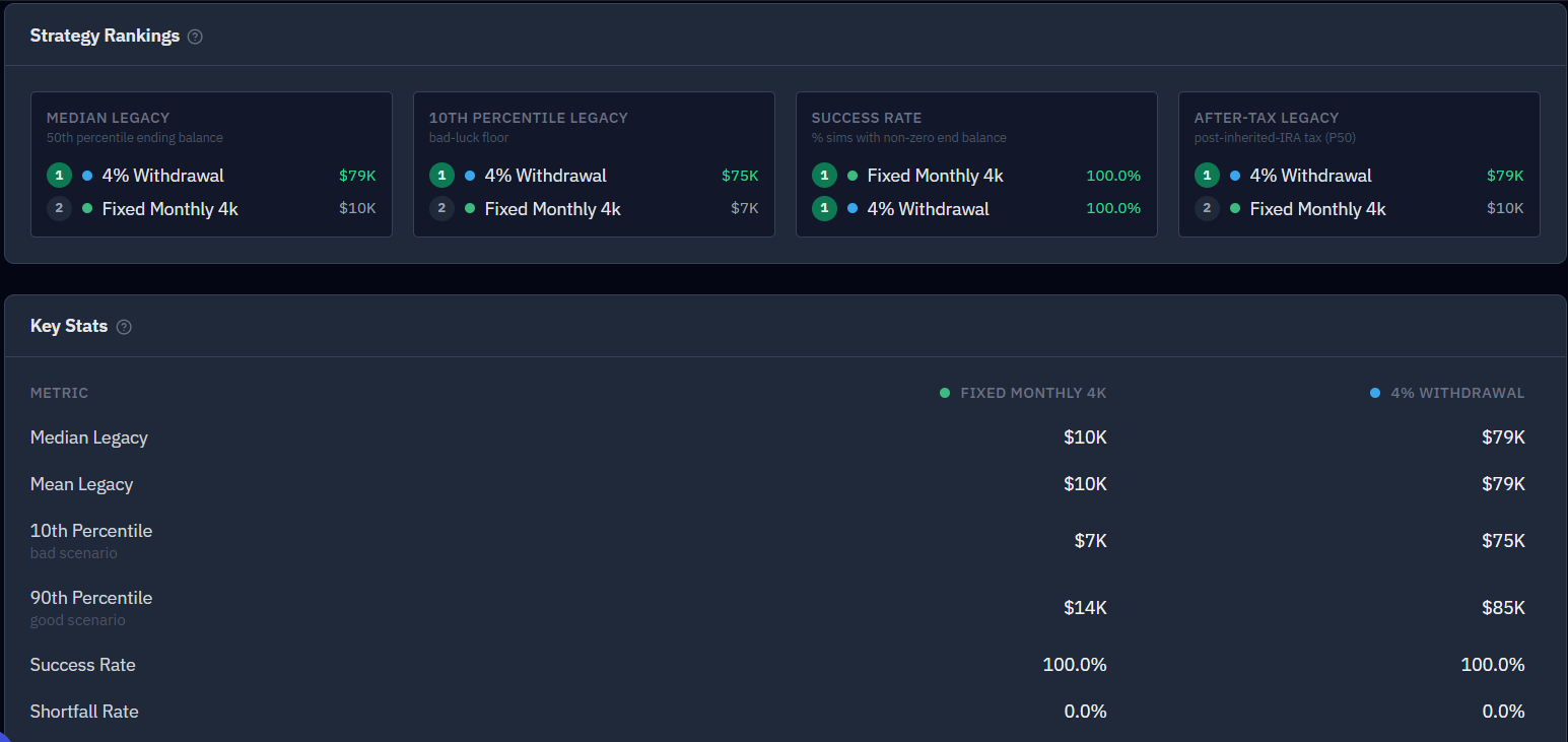
At the top, a Strategy Rankings card; below it, four panels — all sharing one color per strategy.
A quick key to the "P" numbers. You’ll see labels like P10, P25, P50, P75, P90 throughout. They’re percentiles — a plain way to describe the whole range of simulated futures instead of a single guess:
- P50 (the median) is the middle outcome — half the simulated futures did better, half did worse. This is your "typical" result.
- P10 is a bad-luck outcome — only 1 in 10 futures came out worse (9 in 10 did better). Treat it as a stress-test floor.
- P90 is a good-luck outcome — only 1 in 10 did better.
- P25 and P75 are the quarter-marks in between.
Reading them together tells you the spread: when a strategy’s P10 and P90 sit close together, its outcome is steady; when they’re far apart, it swings a lot between lucky and unlucky markets. So "10th Percentile Legacy" below is simply how the unlucky cases hold up, and "Median Legacy" is the middle-of-the-road case.
Strategy Rankings
Four side-by-side columns rank your selected strategies on the metrics that matter most — #1 = best in each column, with the leader highlighted and a color dot matching its chart line:
- Median Legacy — the typical (50th-percentile) ending balance.
- 10th Percentile Legacy — the bad-luck floor: how the unlucky outcomes hold up.
- Success Rate — the share of simulations that finish with money left.
- After-Tax Legacy — median legacy after the tax your heirs owe on inherited accounts (see Taxes).
The rankings are kept deliberately separate — there’s no single "best overall" score. That’s the whole point: it’s common for one strategy to win on Median Legacy while another wins on Success Rate, and a blended score would bury exactly that trade-off. When the columns disagree, the "right" strategy is the one whose winning metric matches your priority — a higher floor and success rate (safety) versus a bigger median and legacy (upside). (Strategies that tie on a metric share a rank.)
The panels
- Stats table — side by side: median and P10 legacy, success rate, Lifetime Social Security received (P50), and the breakeven year (see below).
- Median portfolio trajectory chart — one line per strategy on shared axes, with a Retirement reference line. Hover any point to see each strategy’s value.
- Median monthly income chart — total income (general + medical + Social Security) per strategy. Strategies with different Social Security claim ages visibly diverge when each claim kicks in.
- Ending-balance distribution table — P10 / P25 / P50 / P75 / P90 / Mean for each strategy.
Breakeven is measured against a reference line — the baseline when "Compare against baseline" is on (the column reads "Breakeven vs Baseline"), otherwise your first selected strategy. For each other line it shows the first year that line’s median trajectory crosses the reference’s — or "Never" if it strictly stays ahead the whole way. (The reference’s own column shows "—".) It’s most useful when one plan front-loads spending but pulls ahead later.
A quick example — and why it’s powerful
Save one strategy that spends $7,500/month and another that spends $10,000/month, then compare. Under the same markets the lower-spending plan shows a larger median legacy, and the breakeven column tells you whether (and when) the higher-spending plan ever catches up. Add a third that claims Social Security at 70 and watch its lifetime-Social-Security stat rise and its income line step up later.
Here’s the part that’s easy to underestimate until you’ve seen it. Run those plans separately and each draws its own random markets — so if one comes out ahead, you genuinely can’t tell whether the strategy was better or it simply drew kinder markets. The difference you’re trying to measure is often smaller than the luck between two runs. Comparing them against the identical sequences cancels that luck, so the gap you see is the decision. That’s the whole benefit in a sentence: it turns "which of these looks better?" into a controlled experiment — and once you’ve watched it work, you won’t want to decide any other way.
Common questions and concerns
- Different retirement dates or horizons? The trajectory chart is drawn over the shared time span, so a longer plan shows some tail-truncation. Comparisons are cleanest when the plans share a retirement date.
- Lifetime Social Security showing $0 across the board? That just means you haven’t entered SSA benefit estimates yet — it’s a setup gap, not a bug. Add them on the Household tab, re-save the baseline and strategies, and re-run.
- Settling Optimizer close calls is a prime use of this tab — re-run the finalists here for a clean, shared-seed verdict. See Understanding your results.